TERRA TOYS
Redesigning and improving the online shopping experience for Terra Toys, a locally-owned toy store in Austin, Texas.
Client
Terra Toys
My Role
UX Designer/UX Researcher
Duration
2 weeks
Methods and tools
User Interviews, Competitive/Comparative Analysis, Card Sorting, User Persona, User flows, Wireframing, Prototyping, Usability Testing, Google Drive, Figma, Optimal Workshop
Overview
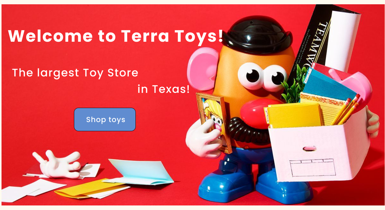
Terra Toys is the largest toy store in Texas operating for over 40 years. They’re looking for ways to stay competitive in the current market and increase their website performance to drive more sales.
The Problem
The existing Terra Toys website had a cluttered layout and poor information architecture, making it difficult for users to browse and shop online. Shoppers struggled to find products, and the site lacked features to guide them, resulting in frustration and a missed opportunity to replicate the engaging in‑store experience that drives most of their revenue.
The Solution
I redesigned the website with a cleaner structure and streamlined navigation, introducing new features like product filters and gift wrapping to improve the overall shopping experience. This solution aimed to make online shopping as seamless and enjoyable as their in‑store experience while supporting the store’s growth.
Research Goals
Understand how users make toy purchase decisions online.
Gather direct feedback on frustrations with the current Terra Toys website.
Identify key usability issues and areas of improvement.
Study competitors to uncover best practices and missing features that could be introduced to the new site.
User Interviews
I conducted 10 one‑on‑one user interviews, combining open-ended questions with usability testing of the current site. These sessions helped uncover user behaviors, frustrations, and unmet needs.

Competitive Analysis
I analyzed direct and indirect competitors (Toy Joy, Walmart, Amazon) to benchmark features and identify gaps.
Key gaps on Terra Toys’ website:
No filtering options (by age, price, interest)
No gift wrapping service
Limited related product suggestions
No loyalty program
Opportunity: By adding these features and improving site organization, Terra Toys can create a more competitive and user-friendly shopping experience.

The Persona
Based on user research, I created a primary persona, Alice, and a usage scenario to better understand how a typical customer would interact with the Terra Toys website. This helped me keep her goals, frustrations, and needs at the center of every design decision.

“Users need a quick and simple way to find a gift online and an efficient checkout process that saves time”.
User Flows
I mapped out key tasks to understand how users like Alice would complete them on a redesigned site. The flows focused on:
1.Finding and selecting a gift:
Alice navigates the site to find a birthday gift for her 8‑year‑old son, who loves music.

2. Checking out efficiently:
Alice completes checkout with delivery and gift‑wrapping options.

Low-fi Wireframes
Based on the research insights and user flows, I created low-fidelity wireframes to plan the structure of the new website before moving on to visual design. Each screen focused on improving usability and streamlining the shopping experience.

1. Landing Page (Includes a prominent, easy-to-use search bar to help users quickly find what they need.).

2. Shop Products (Features a clear filtering system (by category, age, price, and brand) to make browsing fast and efficient.

3. Product Page (Allows users to add products to their cart or wishlist in one click and view ratings at a glance)

4. Cart (Presents a clean and transparent order summary)

5. Checkout (Streamlines the checkout process by allowing users to select delivery options, choose gift wrapping, and apply rewards or gift cards).

6. Order Confirmation (Displays an order status bar so users can clearly see that their purchase is complete).
Usability Testing
I conducted usability testing with five participants to validate the low‑fidelity prototype and uncover any usability issues that might have been missed.
Participants were asked to complete the following tasks:
From the homepage, find a piano instrument for an eight‑year‑old boy.
Sort results by price.
Find a roll‑up piano and add it to the cart.
Add a Monopoly game to the cart.
Complete the checkout process.
Key Takeaways
All participants were able to complete all of the tasks without any problems
They found the website very easy to navigate around with clear toy categories
The checkout process was easy to follow
Participant feedback suggested several refinements:
Add a FAQ, contact information, and store policies to the homepage.
Include a zoom‑in feature on product images.
Provide an “All Toys” option for customers who prefer to browse everything instead of using filters.
High-Fidelity Prototype
After incorporating user feedback, I developed a high‑fidelity prototype that combined all the research insights and design decisions into a polished, intuitive interface.
The final design focuses on making the shopping experience easy, fast, and enjoyable for busy customers like Alice, while improving the overall organization and functionality of the Terra Toys website.
Next Steps
This project showed me how much users value a clear, well‑organized product layout when shopping online, especially when they can’t experience the products in a physical store.
If I were to take this project further, I would focus on adding features like personalized recommendations, improved product visuals (360° images, videos), and accessibility refinements to ensure the experience works well for every customer.